Input forms are the silent heroes of web interactions, facilitating communication between users and digital interfaces. From login screens to subscription forms, their presence is ubiquitous across the digital landscape. In this definitive guide, we’ll delve into the intricacies of input forms, exploring the diverse range of form elements, the various states they can inhabit, and why they are indispensable to UX designers.
Decoding Input Form Elements
Input forms are composed of a myriad of elements, each serving a distinct purpose in collecting user input. Here’s a breakdown of the most common form elements:
Text Input: These versatile fields allow users to input alphanumeric characters, making them ideal for capturing names, email addresses, search queries, and more.

Textarea: Designed for longer-form text input, textareas provide users with ample space to enter comments, feedback, or other lengthy responses.

Checkbox: Checkbox elements allow users to select one or more options from a list of choices. They’re commonly used for consent forms, preference settings, and multiple-choice questions.

Radio Button: Unlike checkboxes, radio buttons restrict users to selecting only one option from a list. They’re ideal for scenarios requiring mutually exclusive choices, such as gender selection or yes/no questions.

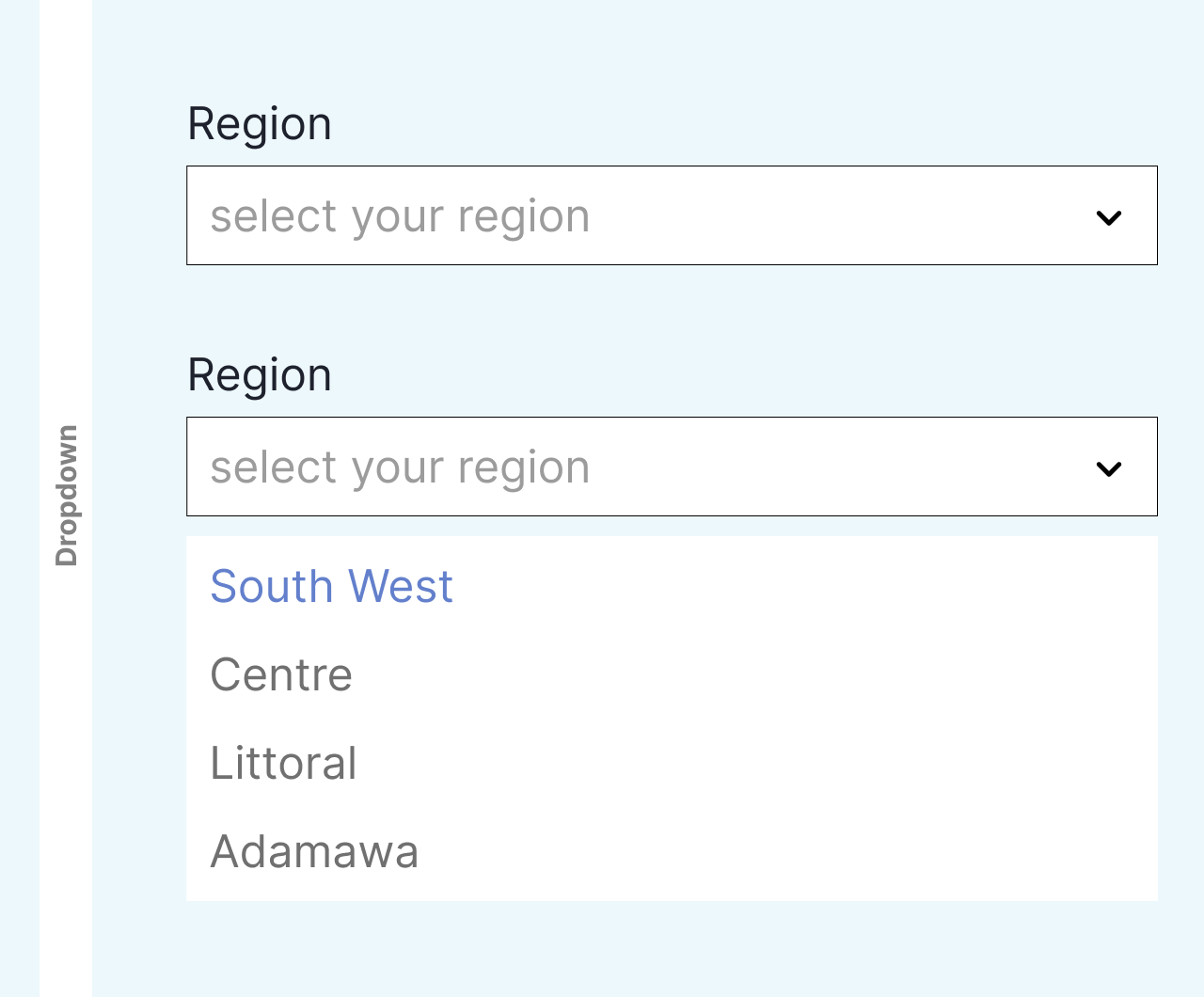
Dropdown Menu: Dropdown menus present users with a list of options in a compact format, conserving space while allowing users to select from a range of choices. They’re commonly used for selecting countries, categories, or other predefined options.

Submit Button: The final step in the form submission process, the submit button triggers the submission of user input for processing. It’s accompanied by validation checks to ensure data accuracy before submission.

Navigating Input Form States
Input forms transition through various states as users interact with them. Understanding these states is crucial for designing intuitive and user-friendly interfaces:
Normal State: The default state of an input form, indicating that it’s ready to receive user input. Placeholder text and styling cues provide guidance to users, signaling where and how to input information.
Focused State: When a user interacts with an input field, it enters the focused state, indicating that it’s actively selected for input. Visual cues like highlighting or expanding the input field help users focus their attention and facilitate input.
Error State: If user input fails validation or encounters an error, the input form enters the error state. Clear error messages and visual indicators guide users in rectifying mistakes and resubmitting the form accurately.
Disabled State: In certain scenarios, input forms may be disabled, preventing user interaction. Disabled states are commonly used for inactive or non-applicable form fields, providing clarity and preventing user confusion.

Importance to UX Designers
UX designers wield significant influence in optimizing input forms for enhanced user experiences. Here’s why input forms are paramount to UX design:
Usability: Well-designed input forms streamline the input process, reduce friction, and guide users toward successful form submission. Intuitive layouts, clear instructions, and error handling mechanisms contribute to a positive user experience, fostering engagement and satisfaction.
Accessibility: Accessible input forms ensure inclusivity by accommodating users with disabilities or diverse needs. Design considerations such as keyboard navigation, screen reader compatibility, and semantic markup improve accessibility, enabling all users to interact with input forms effectively.
Feedback and Validation: Effective feedback mechanisms, including error messages and validation cues, help users understand and correct input errors, reducing frustration and abandonment rates. UX designers play a pivotal role in designing clear and actionable feedback mechanisms that guide users through the input process seamlessly.
In conclusion, input forms are indispensable tools in the UX designer’s arsenal, facilitating user interaction and engagement across digital interfaces. By understanding the diverse array of form elements, navigating different form states, and prioritizing usability and accessibility, UX designers can create input forms that elevate the user experience and drive meaningful interactions on the web.


